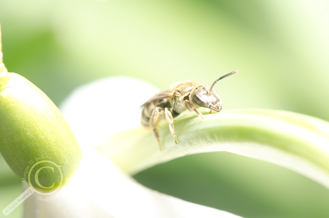
Sometimes equipment, technique and the weather don’t always come together when I’m out photographing insects. Take for example, my recent efforts photographing a halictid bee on a flower. Trying out a new feature on my camera, in the wind and with the winter’s rust still hanging on, I came away with this picture, straight out of the camera:
With the flower stem being blown from shadow to sun in the wind, the flash output was continually adjusting for the wrong situation, and in this case resulted in an over exposed photo with practically no contrast. Despite the windy conditions, the focus is sharp around the eyes (unlike 20 or so other photos in this series) and I liked the composition, so I decided to see where I could take it with some post-processing. If you’re following along at home, I use Adobe Photoshop Lightroom 3 to catalog and edit my photos; all the edits I’ll discuss were made using standard tools in that program.
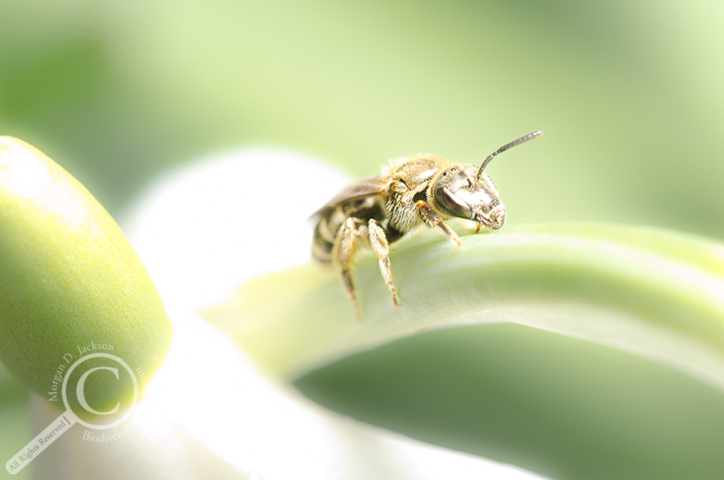
My first thought when I saw this photo was how it had a dream-like feel, so I tried to enhance these qualities. I started by cropping the photo to place the head of the bee near the upper left “third” of the photo, and to get rid of the nubs of flower stem on the left. A quick adjustment to the exposure and contrast to tone down the bright whites and even out the greens, and then a series of masks (using the adjustment brush) to decrease the clarity, vibrancy and sharpness of the background while increasing the contrast and sharpness of the bee, and voila, we have a dreamy bee-scape!
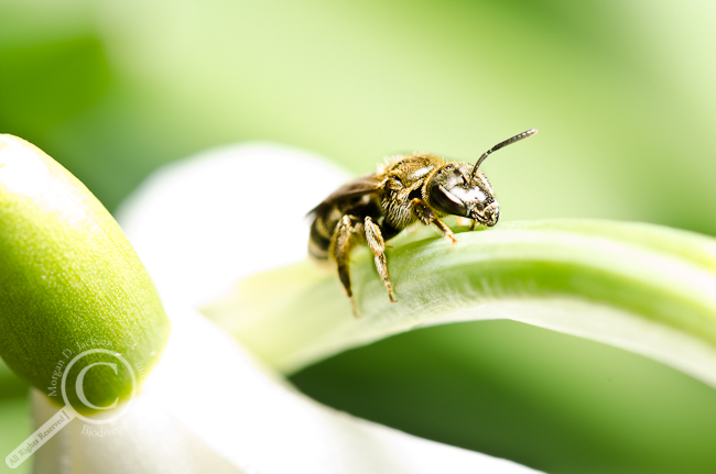
Next, I tried an opposite approach, increasing the contrast throughout the photo in an attempt to go for a stylized, edgy & high-contrast look. Here I darkened the bee by increasing the black point of the photo and keeping the background subtly crisp, while increasing the overall contrast of the image considerably and boosting the saturation a little.
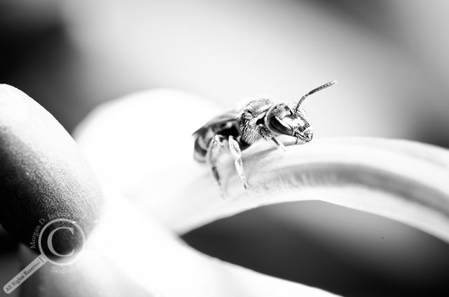
The final approach I took was to convert the photo to black and white, by dropping the saturation to 0 and using a moderate amount of contrast throughout the photo. The way the shadowed areas in the background are arranged makes a nice frame around the bee, and is offset by the white flower petals behind the bee.
Personally, I think I like the black and white effect the most out of these different experiments, but each style has it’s merits. If nothing else, a photo which I would normally not give a second glance before deleting turned out to be one of my favourite images this year. Sometimes “bad luck” can turn out to be something special afterall! Imagine what would have happened if everything had gone how I’d originally planned:
Does one of these versions stand out to you? Let me know what you think in the comments!

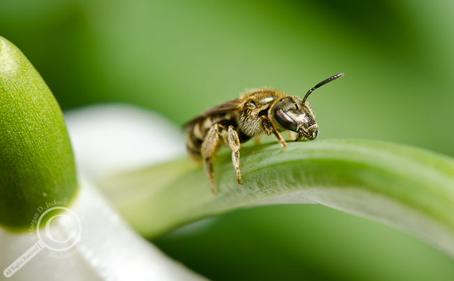
Though I like the artistic feel of McDreamy, and the BW version speaks to my minimalist roots, the scientist in me still prefers the crisp detail and proper colours of the ‘correct exposure’. It certainly is fun to play around with contrast etc though isn’t it.
I gotta agree with you Chris, morphology is cool enough on it’s own without fancy effects!
Agreed – and way to go “rescuing” that photo.
I really need to learn how to use photoshop, these look amazing Morgs:) Maybe PS will make up for my lack of photography skills
Learning PS can help you make the most of a photograph, but it’s not necessarily a cure-all panacea. Next time you’re in Guelph we’ll have to go out shooting together!
Haha sounds good, I’d really like that:D
I’m pure left-brained science all the way, so I definitely prefer the final version. Nice job rescuing that shot – it was definitely worth the effort.